Download the free trial version
Basic4android Video
Features
Tutorials and manuals
Showcase
Screenshots

Go Back   Android Development Forum - Basic4android > Basic4android > Basic4android Getting started & Tutorials
Documentation Wiki Register Members List B4P Search Today's Posts Mark Forums Read

Basic4android Getting started & Tutorials Android development starts here. Please do not post questions in this sub-forum.

StateListDrawable example

Reply
 
LinkBack Thread Tools Display Modes
  #1 (permalink)  
Old 11-14-2010, 02:16 PM
Erel's Avatar
Administrator
 
Join Date: Apr 2007
Posts: 15,689
Awards Showcase
Basic4ppc Founder 
Total Awards: 1
Default StateListDrawable example

StateListDrawable is a drawable objects that holds other drawables. Based on the view's current state a child drawable is selected.
StateListDrawable holds a list of states. States can be "disabled", "enabled", "checked" and so on.
A state can also be a combination of other states (like enabled and pressed).

The StateListDrawable holds a list of states and drawables pairs. Whenever the view's state changes the list is scanned and the first item that matches the current state is chosen.
Matching means that all elements in the state item are included in the current state.
This means that an empty state item will match all current states.
The order of states added is very important as the first item matches will be chosen.

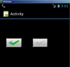
This example creates a ToggleButton and sets its two states (checked and unchecked) to two ColorDrawables.
Code:
Sub Process_Globals

End Sub

Sub Globals

End Sub

Sub Activity_Create(FirstTime As Boolean)
    
Dim tb As ToggleButton
    tb.Initialize(
""'no events will be caught
    Dim checked, unchecked As ColorDrawable
    checked.Initialize(
Colors.Green, 10dip)
    unchecked.Initialize(
Colors.Red, 10dip)

    
Dim sld As StateListDrawable
    sld.Initialize
    sld.AddState(sld.State_Checked, checked)
    sld.AddState(sld.State_Unchecked, unchecked)
    tb.Background = sld
    tb.Checked = 
True
    tb.TextColor = 
Colors.Blue
    tb.TextSize = 
20
    tb.Typeface = 
Typeface.DEFAULT_BOLD
    Activity.AddView(tb, 
100dip100dip100dip100dip)
End Sub
Note that in this case the order is not important as no state is contained in another.


Reply With Quote
  #2 (permalink)  
Old 12-15-2011, 08:55 PM
Newbie
 
Join Date: Oct 2011
Posts: 8
Default

Sorry - how do you apply this to say the panel_touched event, which does not have a .checked suffix applied to it?
Reply With Quote
  #3 (permalink)  
Old 12-15-2011, 09:06 PM
klaus's Avatar
Basic4ppc Expert
 
Join Date: Oct 2007
Location: Fully, Switzerland
Posts: 4,461
Awards Showcase
Forum Contributer Beta Tester Competition Winner 
Total Awards: 3
Default

What exactly do you want to do?

Best regards.$
__________________
Klaus
Switzerland

Beginner's Guide / User's Guide
Reply With Quote
  #4 (permalink)  
Old 12-17-2011, 10:56 PM
Newbie
 
Join Date: Oct 2011
Posts: 8
Default

sorry - i wanted to change the state of a panel based on whether it had been touched or not. I solved my own problem though. sorry to clog up this thread....
many thanks
eyp
Reply With Quote
  #5 (permalink)  
Old 05-14-2012, 10:21 PM
Roger Garstang's Avatar
Senior Member
 
Join Date: Apr 2012
Location: Missouri, US, North America, Earth
Posts: 126
Default

In trying to understand how this works, I made a little function to aid in creating a Gradient Button:

Code:
Sub ButtonGradient(ColorList() As IntAs StateListDrawable
    
' Define a GradientDrawable for Enabled state
    Dim gdwEnabled As GradientDrawable
    gdwEnabled.Initialize(
"TOP_BOTTOM",ColorList)
    gdwEnabled.CornerRadius = 
5
    
' Define a GradientDrawable for Pressed state
    Dim gdwPressed As GradientDrawable
    gdwPressed.Initialize(
"BOTTOM_TOP",ColorList)
    gdwPressed.CornerRadius = 
7
    
' Define a GradientDrawable for Disabled state
    Dim gdwDisabled As GradientDrawable
    gdwDisabled.Initialize(
"TOP_BOTTOM"Array As Int(Colors.LightGray, Colors.DarkGray))
    gdwDisabled.CornerRadius = 
5
    
' Define a StateListDrawable
    Dim stdGradient As StateListDrawable
    stdGradient.Initialize
    stdGradient.AddState2(
Array As Int(stdGradient.State_enabled, -stdGradient.State_Pressed), gdwEnabled)
    stdGradient.AddState(stdGradient.State_Pressed, gdwPressed)
    stdGradient.AddState(stdGradient.State_Disabled, gdwDisabled)
    
Return stdGradient
End Sub
This can be used like:

Code:
newBtn.Background = ButtonGradient(Array As Int(Colors.RGB(5020550), Colors.RGB(0,128,0)))
to create a nice green button that flips the gradient when pressed and has a disabled state.

I used a few things as examples from both here and the manual as well as my own tweaking and making it create/dim the least amount of variables.

One thing I had some confusion understanding at first though is the -stdGradient.state_pressed stuff. I got that they are some type of int flags and for some reason they are combined in an array instead of using OR. So, that sets the enabled state when NOT Pressed. I would have expected to see Not() used though. This just negates an integer. Using some toast messages it appears the opposite values are negatives of each other like -State_Enabled = State_Disabled. It was a little confusing without testing to see how they worked. We have Checked/Unchecked and Enabled/Disabled, but Pressed and Selected are missing matching pairs. It might be a good thing to add the matching pairs to the StateListDrawable class in B4A so code can be cleaner.

Last edited by Roger Garstang : 05-14-2012 at 10:23 PM.
Reply With Quote
Reply


Currently Active Users Viewing This Thread: 1 (0 members and 1 guests)
 
Thread Tools
Display Modes

Posting Rules
You may not post new threads
You may not post replies
You may not post attachments
You may not edit your posts

vB code is On
Smilies are On
[IMG] code is On
HTML code is Off
Trackbacks are Off
Pingbacks are Off
Refbacks are On


All times are GMT. The time now is 10:17 AM.


Powered by vBulletin® Version 3.6.12
Copyright ©2000 - 2012, Jelsoft Enterprises Ltd.
Search Engine Friendly URLs by vBSEO 3.3.0